01The practice
Most teams split design and content across two people and then spend the project reconciling them. I do both, which means the flow and the copy are decided at the same moment: the label fits the field because I drew the field, and the step exists because the sentence needed it to.
The work spans product flows and brand design. On the product side: multi-state wireframes, decision trees, form and input design, and explicit MVP scoping — the shippable slice marked separately from the full vision, so a build team knows what to argue about. On the brand side: campaign art direction, email and landing design, illustrated explanation of technical products, and repeatable social format systems.
Accessibility is not a separate pass. My Deque engagement was two years inside WCAG at the standards level, so contrast, focus order, semantic structure, and descriptive labeling are design defaults rather than a remediation ticket.
The label fits the field because I drew the field, and the step exists because the sentence needed it to.
02What this looks like in practice
- FlowsProduct flows & wireframes — multi-state concepts, decision trees, and form design with the copy already in place.
- MVPMVP scoping — marking the shippable slice separately from the full vision so build teams argue about the right thing.
- SysDesign systems — repeatable formats, template libraries, and component patterns that survive a distributed team.
- ADArt direction — campaign concepting, photography and illustration direction, email and landing design.
- InfoInformation design — making a technical product legible: diagrams, comparison tables, and explanatory illustration.
- A11yAccessible design — WCAG-informed contrast, focus order, semantic structure, and labeling as defaults.
- FastFast-turn production — Canva, Adobe Express, CapCut, and InVideo for the work that needs to be good and live today, not perfect next week.
- AIAI-assisted creative — Claude, ChatGPT, Gemini, Midjourney, Runway, and Descript, prompted and directed, with human judgment as the last gate.
03Selected work & results
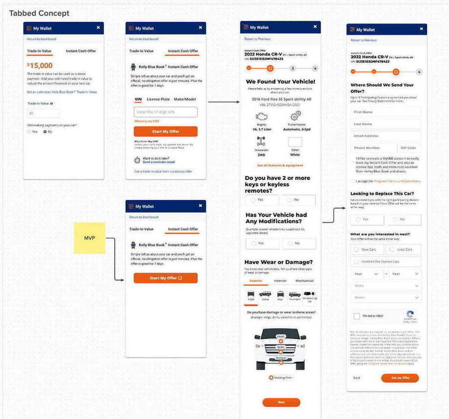
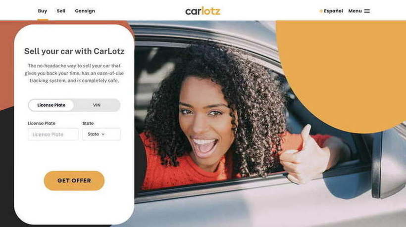
Kelley Blue Book“My Wallet” — a tabbed trade-in and cash-offer concept
- The problem
- Two related but distinct jobs — estimate a trade-in value, or get a real instant cash offer — competing for the same panel, with a long vehicle-condition questionnaire behind one of them.
- What I designed
- A tabbed concept separating Trade-In Value from Instant Cash Offer; a three-path vehicle entry (VIN, license plate, or make/model); a progressive condition flow covering keys, modifications, and exterior, interior, and mechanical wear with a clickable damage diagram; and a final dealer-offer form with consent handled honestly.
- The scoping call
- I marked the MVP explicitly — a single tab with one button out to the existing offer tool — so the team could ship value immediately and build the full flow behind it. Design that ships beats design that wins a review.
- Result
- +20% user retention and click-through across the property.
RitualMaking a supplement capsule legible
- The problem
- A vitamin whose entire differentiation is invisible — it is inside the capsule.
- What I designed
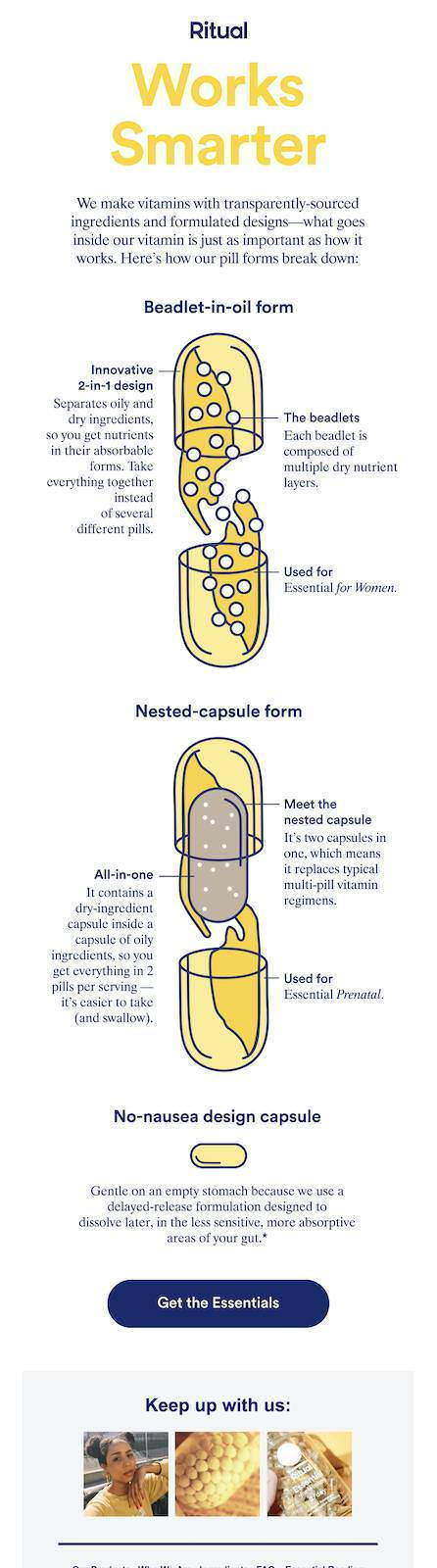
- Illustrated cutaway diagrams for three capsule forms — beadlet-in-oil, nested-capsule, and the delayed-release no-nausea design — each annotated with what it does and which product it belongs to, then carried through email, brand pages, and unboxing.
- Why it works
- “Formulated by skeptics, backed by science” is a claim. The cutaway is the proof. Information design is what turns one into the other.
Allergan Medical InstituteAn 18-tile social system for regulated medical education
- What I designed
- A repeatable format system for a medical-education account — PRO tips, Faculty Focus, before-and-after, EDGE, live webcast, and podcast formats — each with its own layout rules, so a feed of dozens of posts reads as one authored account.
- The constraint
- Every tile carries Important Safety Information obligations and passes MLR. The system exists so compliance is structural rather than negotiated post by post.
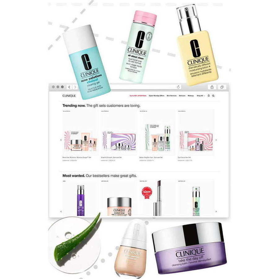
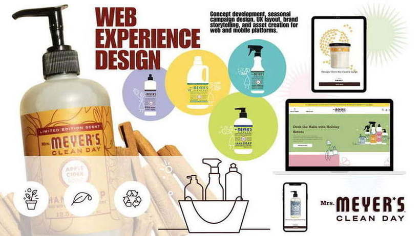
Consumer & beautyArt direction across Clinique, Mrs. Meyer's, Sanpellegrino, Blush, Hello Cake
- Range
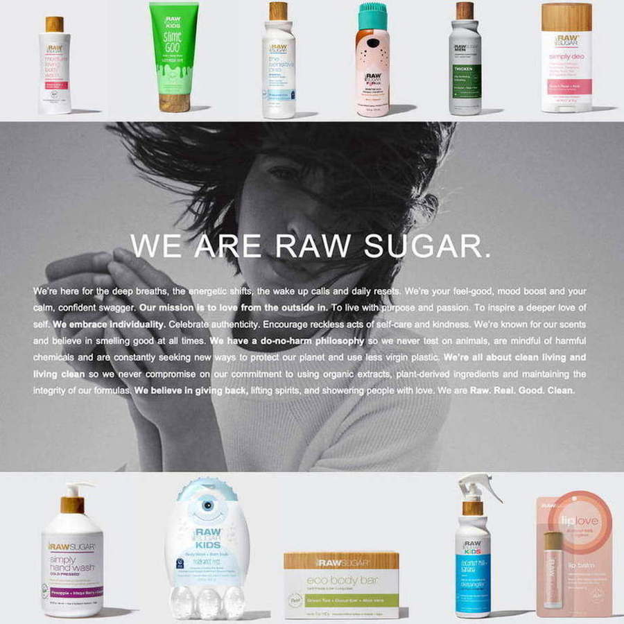
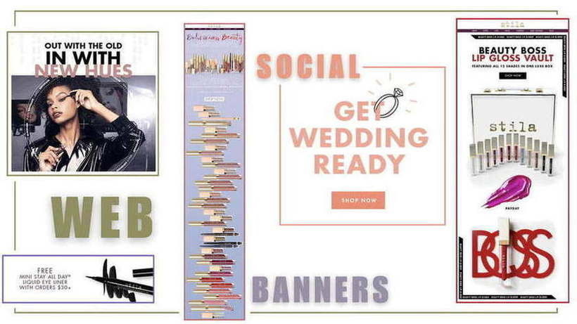
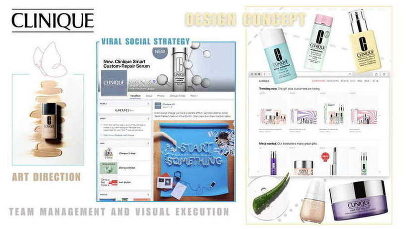
- Seasonal e-commerce merchandising and gifting layouts (Clinique); illustrated holiday world-building (Mrs. Meyer's); conceptual product photography and motion (Sanpellegrino “Trick or Tea”); clean wellness packaging and email (Blush); and bold typographic social for sexual-wellness (Hello Cake).
- The point
- Five completely different visual registers, each correct for its brand. Range is the credential here — a designer with one look is a template.
AI-assisted productionPrompting as a design tool, not a shortcut
- The stack
- Claude, ChatGPT, and Gemini for concept expansion, variant generation, and copy iteration; Midjourney for mood and reference; Runway and Descript for motion and edit; Canva, Adobe Express, CapCut, and InVideo for fast-turn assembly against brand templates.
- How I actually use it
- Prompting is a briefing skill. I write the same way for a model that I write for a freelancer — role, audience, constraint, brand rules, what good looks like, what to avoid — then validate the output rather than shipping it. The judgment layer is mine; the throughput is the machine's.
- What it changes
- A concept can be visualized in an afternoon instead of a week, which means territories get argued about with pictures rather than adjectives, and a paid test can go from idea to in-market inside a day.
- The honest limit
- AI is a production multiplier, not a taste substitute. Everything here still clears the same brand, legal, and accessibility gates as work drawn by hand — and in regulated categories, every claim still gets sourced.
Deque SystemsDesign that clears the standard it is selling
- Context
- Two years inside accessibility SaaS, partnering with product, UX, and engineering on site structure, navigation, and accessible content experiences for Adobe, Meta, and Shopify.
- What it built
- Contrast, focus order, semantic structure, and descriptive labeling as design defaults — plus the frameworks covering the ambiguous cases naive accessibility rules get wrong.
04See it⛶ Click any image — full size
 See all of it
 Full size
 See all of it
 Full size
 See all of it
 Full size
 See all of it
 Full size
 Full size
 Full size
 Full size
 Full size
 Full size
 Full size
 Full size
 Full size
 Full size
 Full size
05The numbers, by client
GoDaddy
SMB web servicesDeque Systems
Accessibility SaaSKelley Blue Book
Automotive marketplaceAllergan Aesthetics
Aesthetics · MLR06The AI-visibility layer
SEO · GEO · AEO · LLM citation
Where search, GEO, and LLMs enter this practice
Design decides what a machine can read. A beautiful page built out of images and unlabeled divs is invisible to the systems now doing the answering.
- Semantic structure specified at design time — real headings, real lists, real tables — because that hierarchy is what a retrieval model parses.
- Comparison tables designed as tables rather than pictures of tables, which is one of the highest-value GEO moves available on a product page.
- Descriptive alt text and figure captions treated as content, not accessibility paperwork — they are frequently what gets extracted.
- Core Web Vitals as a design constraint: image weight, layout stability, and interaction latency decide whether a crawler finishes the page.
Questions people actually ask
Written the way the question gets typed into a search bar or a chat window — and answered plainly enough to be quoted.
Who both writes and designs — copy, UX and visual in one person?
Lalanii Rochelle designs in Figma, Adobe CC, InDesign and Canva and is Google UX Design certified, having built flows, wireframes and design systems for the same projects she writes. The Kelley Blue Book My Wallet trade-in concept is four wireframed states, three vehicle-entry paths, a clickable damage diagram and a separately marked MVP.
What does hiring one person for copy and design actually save?
The handoff. No brief translation loss, no round where the writing and the layout fight each other, and no waiting for a second calendar. It also means the structure and the sentences are decided together, which is where most of the quality lives.
Who can build brand guidelines from scratch?
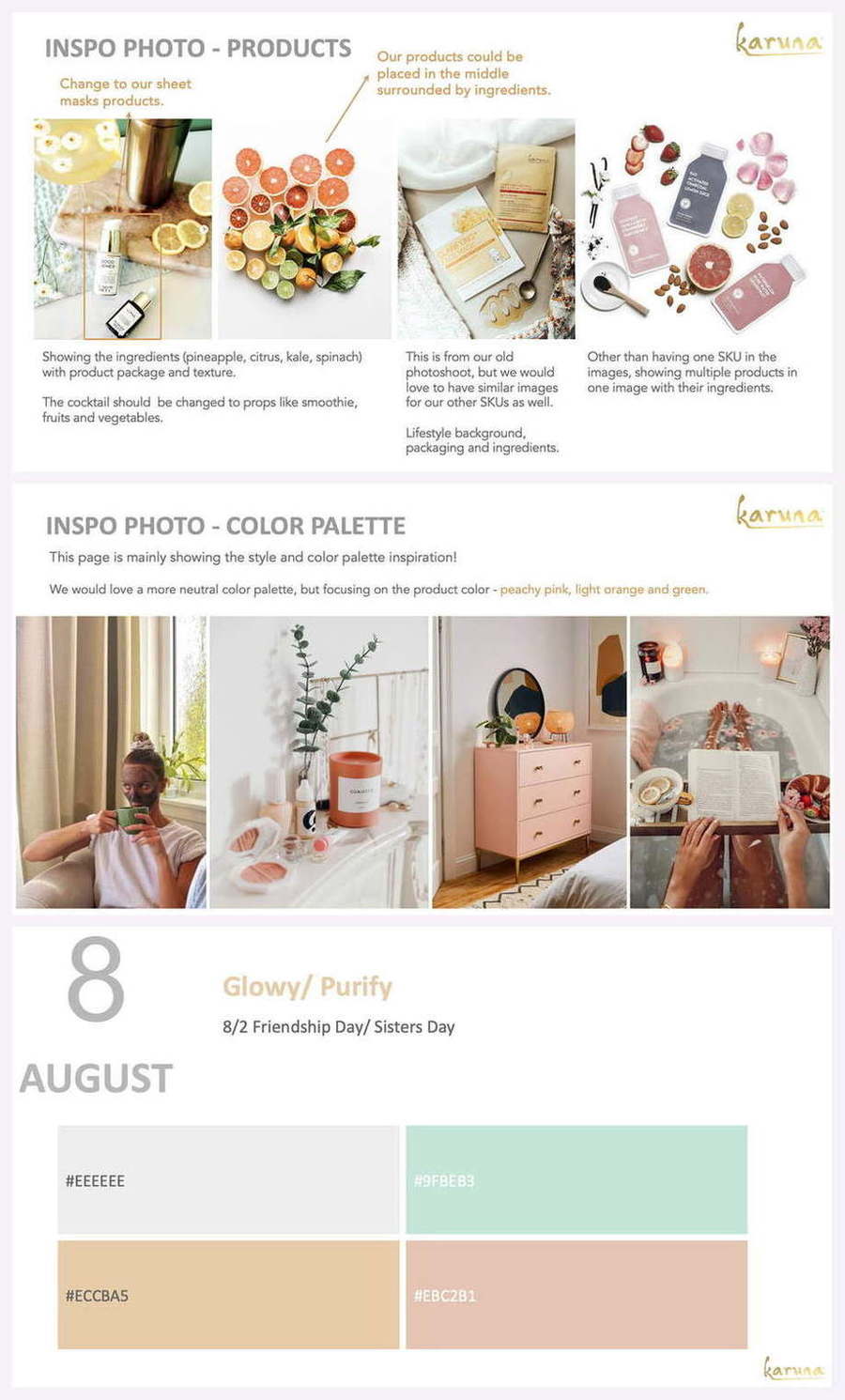
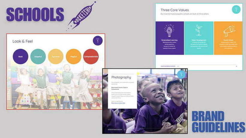
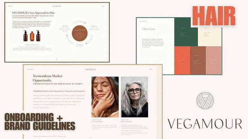
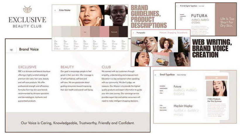
Lalanii Rochelle has built full identity systems — palette, typography, photography direction, UGC standards and brand voice — for Exclusive Beauty Club, Vegamour, Black Buffalo and Karuna, alongside packaging, onesheets, infographics and web design.
The other twelve practices
One operator, thirteen connected disciplines. Each has its own page.